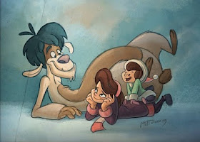
He's been keeping a blog to document his progress, and it's great getting insight into his decision-making. I mean, modern yeti illustrators have a lot of decisions to make! There is no one way to depict a yeti.
Here you can see some of his initial designs for his character. He chose to go with the most lanky and lovable.

I liked Doering's thoughtful explanation on how he decided on the coloring for his yeti:
Most people choose a lighter toned Yeti, which I agree is appropriate because that is what generally separates Yeti's from Bigfoot interpretations. However, most Yeti interpretations I've seen included some variation of white on blue. Following suit for this Yeti design is, I think, a tad cliche. The Yeti in "Emma and Moly's Pet Yeti," is a very "different" yeti, not only in personality but also in appearance. I not only choose a warm neutral scheme because it stands out nicely against a cold environment, but a warm fur, gives him, I think more character. Think of it this way: red is hair is to humans as brown or warm fur tones are to Yeti's. This Yeti is playful, he's creative, he's care free, and he's intelligent. He's not a big, hulky mass that likes to eat and smash things. I wanted his coloring to reflect this. I did however, keep a blueish-green nose, and teal hair to tie him back to his cold origins. I also choose to give him a dark patch over his eyes for two reasons: many animals have this feature, and it is a common feature among various Yeti interpretations. Also, the darker patch helps his eyes stand out against his light fur tone.

I am curious to see if other artists tasked with depicting yeti share Doeiring's belief that the standard white & blue is cliche. As time goes on, will we start to see more and more warm-toned yetis?
This is a very warm and cute yeti, but I wouldn't know he was a yeti unles he was labeled. By rejecting the "cliches," it also seems he's rejecting most commonly accepted yeti features. Not that I have a problem with that.
ReplyDeleteI really like his thoughtful explanation, but it also makes me appreciate how many artists DO manage to make white and blue (and often very simple, understated) yetis seem so warm and personable.
By the way, I LOVE the character sketches! Thanks to Matt for sharing so much of his process. :-)
ReplyDelete